When Do They Sleep? A small suggestion

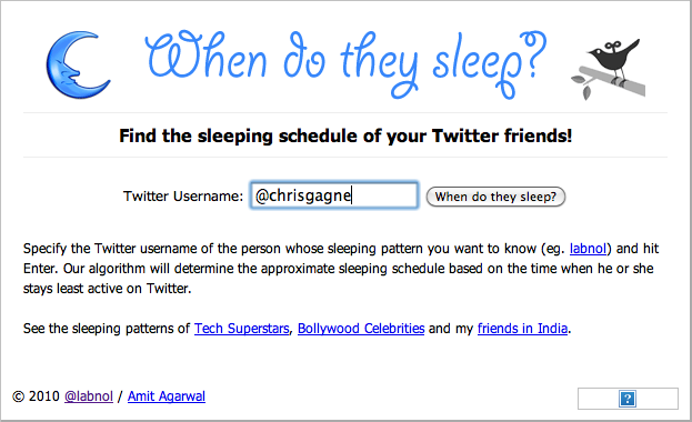
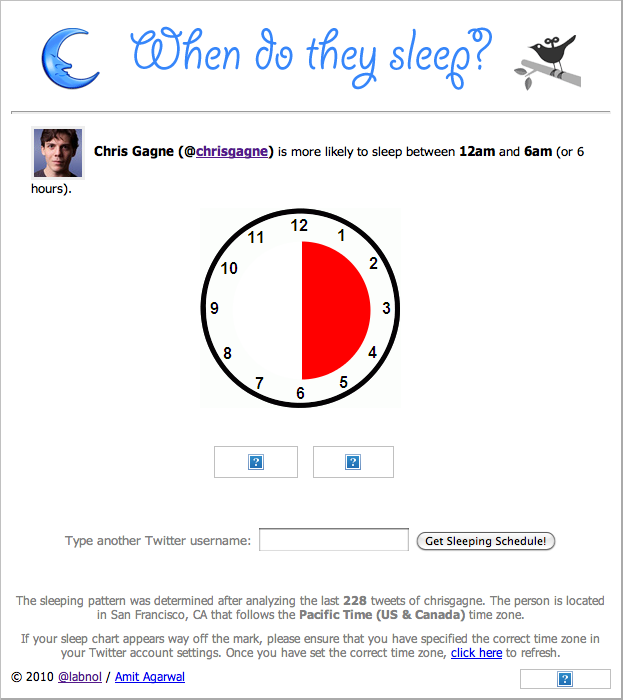
I first learned about “When Do They Sleep,” a project from Amit Agarwal (http://labnol.org, @labnol) at MozCon 2012. The suggestion was to identify when your target blogger slept so that you could tweet to them at a time they were most likely to be awake.

I like the tool and it seems relatively accurate, at least based on my tweeting patterns. I just have one minor suggestion… strip leading @s from the user name. Sure, the user should “know better.” But sometimes we haven’t had enough coffee and this is a very simple fix that might improve the experience for a few more users.

2012-07-27T13:27:46-08:00July 27th, 2012|0 Comments

Yapp.us has a beautiful layout and form design

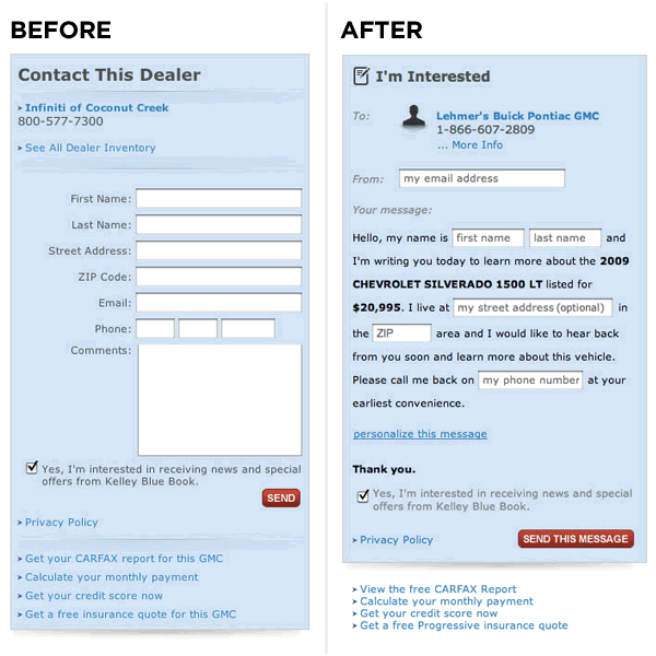
I first ran across “Mad Libs” style form designs about two years ago when I read Luke Wrobleski’s blog post “Mad Libs” Style Form Increased Conversion by 25-40%.

Here’s the image they used to illustrate the differences (taken from Luke’s post who in turn obtained it from Ron Kurti):

I’ve used this form design on a couple of products and I’ve always been impressed with the conversion improvements.

I came across Yapp.us from a Twitter post retweeted by @DovSeidman, CEO of LRN and checked out their site. Here’s a screenshot:

So what do I like about it?

  • The form design. it’s fast, easy, and fun. Click on a field, select a radio button, and it updates the chalkboard. By using the form, I simultaneously hear and tell a story: “I <3 apps. I have like >50 on my Android device. I dream about creating an app of my own. Let me create one in minutes + for free.”
  • The site’s voice. It’s informal and friendly but not edgy or irreverent.
  • It’s subtle, but they’ve done a elegant job of compositing the assets. In particular, wiggle the window size around a bit and look at what happens to the thought bubbles.

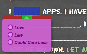
Updated for better description: I did notice one drawback, however. The “mad lib” bubbles pop up when you hover over a field, but one has to be very careful about moving the mouse from the “_____” to the radio buttons. Here’s the issue, illustrated with a slightly exaggerated image:

  1. The user activates the control by hovering the cursor in the blue area.
  2. The user is expected to transition from the blue area to the magenta area.
  3. In the current Yapp experience, the user must move the cursor through the green shaded area if they want to reach the magenta area without it closing. Put another way, if the user’s cursor is in the left or right periphery of the blue area, they must first move their cursor to the center of the blue area and then move straight down through the green area.
  4. In the ideal experience, the user can move in a straight line from any part of the blue area to the magenta area. I might also add a ~1/50th second delay before hiding to assist in the cases in which the user might “clip a corner” on the way from one field to another.

Anyway, that’s pretty nit-pickey. 🙂

I’m looking forward to trying the beta, Luke!

2012-07-14T11:16:21-08:00July 10th, 2012|1 Comment

Best Practices and Techniques for Increasing Page Views

I’ve been exploring a variety of ways to increase page views and sharing activity on websites. Here are a few techniques that I’ve seen lately that I found interesting… what have you seen?

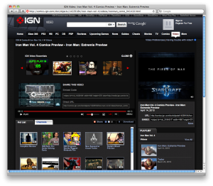
A few seconds after a user watches a video on IGN, the page refreshes and brings the user to the next video. This seems like a clever way of encouraging a user to keep watching one video after another. If the user walks away from their machine for a while, it will also drive up preroll advertising inventory. Clever!

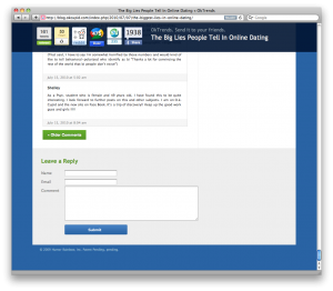
OKCupid is a free dating site with some clever user interface details. Their “OKTrends” blog has an interesting social media toolbar that swings into view when a user approaches the end of the blog entry.

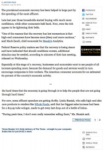
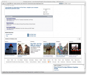
Intuitively this makes a lot of sense; designers often place social bookmarking links at the top of the article, but users aren’t likely to respond to the suggestion that they share an article until after they have read it. Sure—seems obvious—but even big-time sites like the NY Times get this one wrong:

I do like the NY Times “Read the next article” widget that pops up as you approach the end of an article:

So what techniques do you use to increase page views and sharing of your content?

2012-07-26T11:00:44-08:00July 16th, 2010|1 Comment
Go to Top