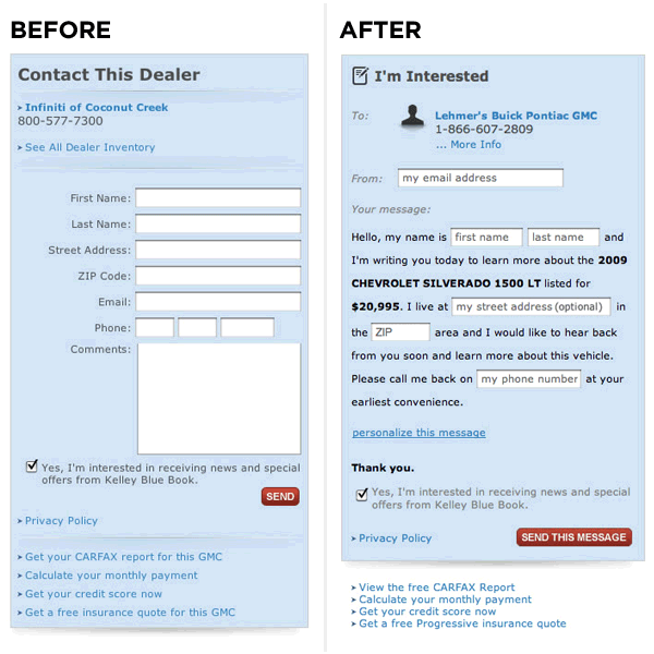
I first ran across “Mad Libs” style form designs about two years ago when I read Luke Wrobleski’s blog post “Mad Libs” Style Form Increased Conversion by 25-40%.
Here’s the image they used to illustrate the differences (taken from Luke’s post who in turn obtained it from Ron Kurti):
I’ve used this form design on a couple of products and I’ve always been impressed with the conversion improvements.
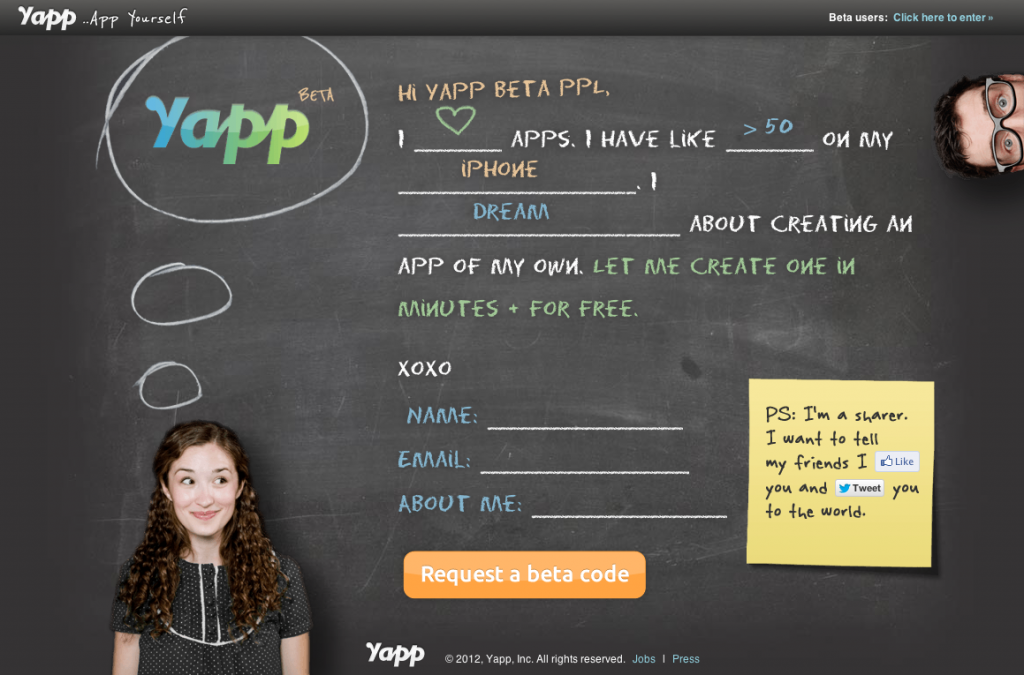
I came across Yapp.us from a Twitter post retweeted by @DovSeidman, CEO of LRN and checked out their site. Here’s a screenshot:
So what do I like about it?
- The form design. it’s fast, easy, and fun. Click on a field, select a radio button, and it updates the chalkboard. By using the form, I simultaneously hear and tell a story: “I <3 apps. I have like >50 on my Android device. I dream about creating an app of my own. Let me create one in minutes + for free.”
- The site’s voice. It’s informal and friendly but not edgy or irreverent.
- It’s subtle, but they’ve done a elegant job of compositing the assets. In particular, wiggle the window size around a bit and look at what happens to the thought bubbles.
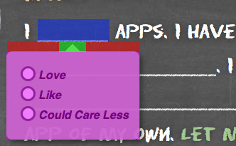
Updated for better description: I did notice one drawback, however. The “mad lib” bubbles pop up when you hover over a field, but one has to be very careful about moving the mouse from the “_____” to the radio buttons. Here’s the issue, illustrated with a slightly exaggerated image:
- The user activates the control by hovering the cursor in the blue area.
- The user is expected to transition from the blue area to the magenta area.
- In the current Yapp experience, the user must move the cursor through the green shaded area if they want to reach the magenta area without it closing. Put another way, if the user’s cursor is in the left or right periphery of the blue area, they must first move their cursor to the center of the blue area and then move straight down through the green area.
- In the ideal experience, the user can move in a straight line from any part of the blue area to the magenta area. I might also add a ~1/50th second delay before hiding to assist in the cases in which the user might “clip a corner” on the way from one field to another.
Anyway, that’s pretty nit-pickey. 🙂
I’m looking forward to trying the beta, Luke!


Nice writeup, Chris! The team at Yapp was also inspired by @lukew’s original surfacing of this approach, and it’s worked really well for us. Thanks for noticing the little details, and for the criticism about the popup behavior. Our choice was based on fear that users would not know to click in the blank spaces, but in retrospect, we probably should have tested it.
And if you like the details and UX on the beta signup page, you’ll find a lot to like in the product itself!
Cheers,
Luke Melia
Co-founder & CTO, Yapp