See Where Work Waits
Delivery Intelligence reads a team’s own work-tracking data and shows where delivery actually gets stuck: where work waits, which priorities have inverted, and which dates you can defend. It is one of the tools I build: not a product I sell, but the recurring analysis I used to do by hand, turned into software so the work doesn’t need me in the room. It never measures individuals, and there is no model in the maths; every number is deterministic and traceable to the stories that produced it.
The screens below use synthetic demo data.
Most delivery problems are queue problems
Leaders often reach for more utilisation when the real loss is waiting. In knowledge work a unit of work spends most of its life idle in a queue rather than being worked; Reinertsen puts active time at 5–15% of the total. So the gain comes from finding the queues, the priority inversions, and the unplanned-work spiral before they set. And most delivery tools show status, not flow.
“Active work is 5–15% of total time. The rest is waiting in queues.” Every view in the tool is built to make that waiting visible, and to price it.
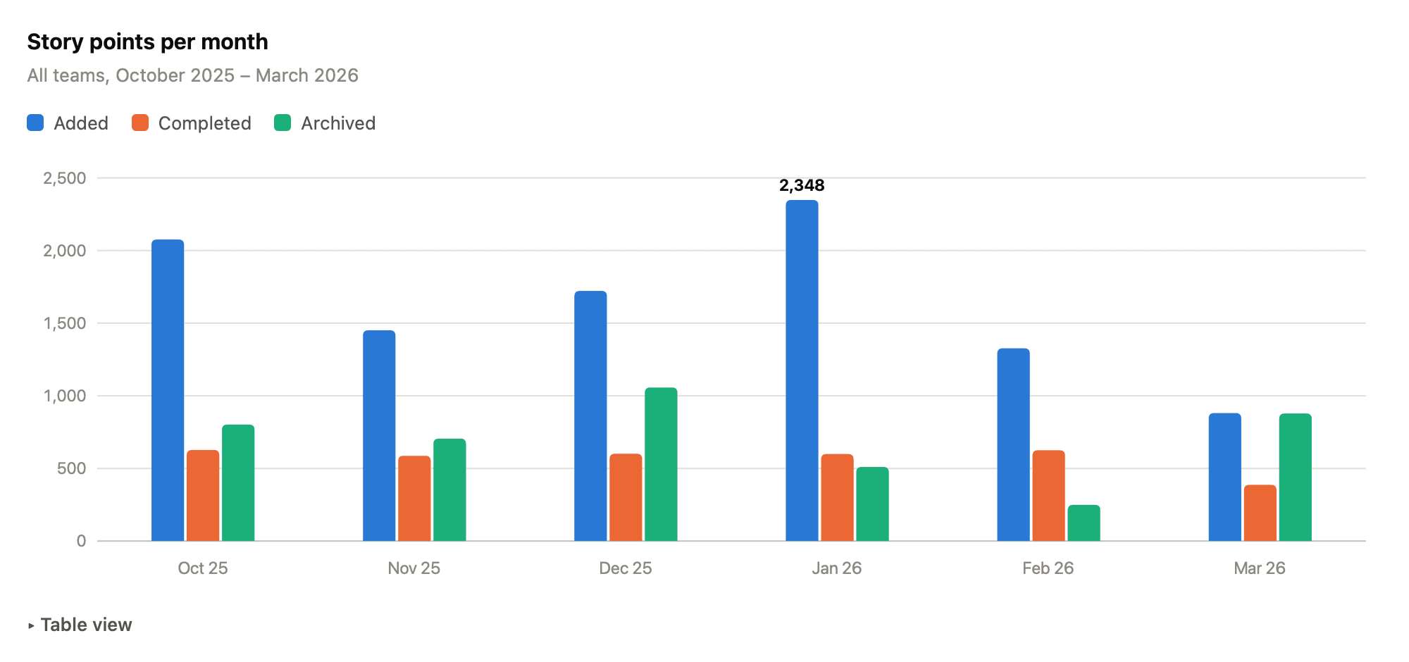
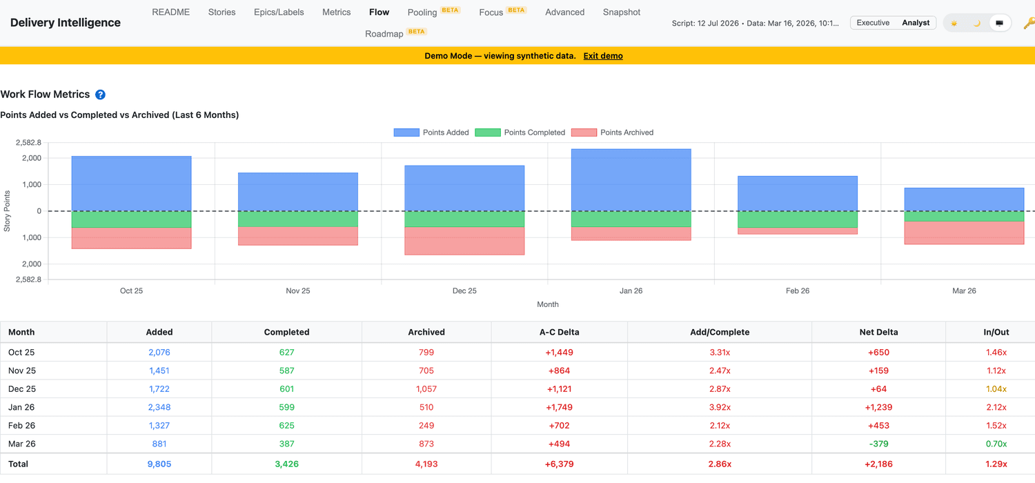
Your tracker already holds the evidence: every story carries its full workflow history, and the first thing the tool draws from it is the intake picture. In the demo organisation, January added 2,348 points against 599 completed. Added outrunning completed means queues are growing. And the archived series (time invested in writing backlog items that are then abandoned) rivals completed delivery in several months.
Planning health, in one view
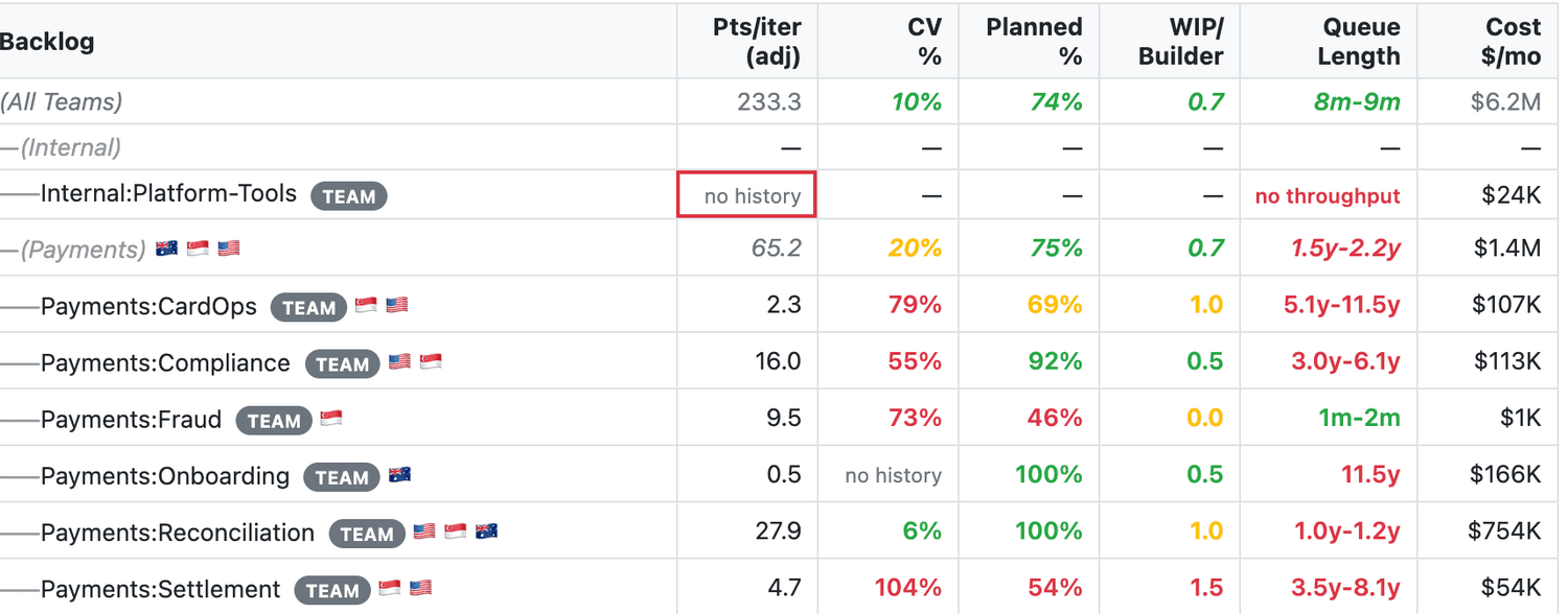
Every team, capability, value stream, and department sits in a single table: realistic planned-adjusted velocity, work in progress against capacity, queue length, the share of work that was actually planned, and whether stories are sized for their tier. Each cell is graded against thresholds drawn from the literature: planned work below 60% trips Kim’s “death spiral” red; work in progress past three-quarters of capacity flags the utilisation trap that Reinertsen’s queueing maths predicts.
Velocity is decay-weighted across up to 13 completed iterations,10% less weight per iteration back, so recent pace counts most. then adjusted by the team’s planned-work share, which turns “what we finished” into “what we can promise against a plan.” Beside it sits the coefficient of variation, which tells you whether that velocity is a number you can plan on or an average of chaos. Where a team has no usable history, the tool says “no history” rather than printing a dash; missing data is reported as missing, never smoothed over.
1 10% less weight per iteration back, so recent pace counts most.
Where the work actually waits
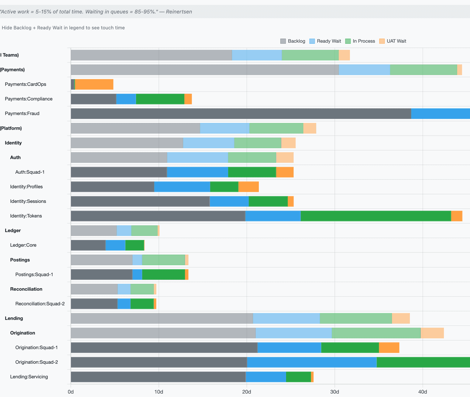
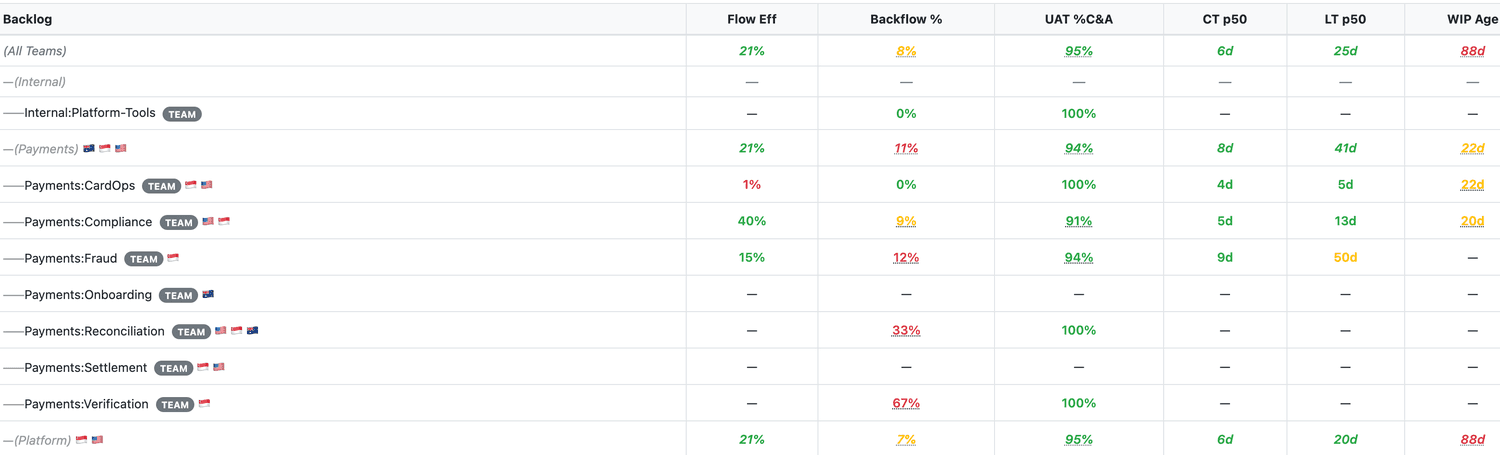
The tool breaks lead time into its parts, team by team: time sitting in the backlog, waiting in Ready, in active development, and stuck at UAT. The coloured bar makes the queue time impossible to miss (it’s usually most of the bar). Beside it sit the flow diagnostics: flow efficiency, first-pass yield at the UAT handoff, cycle time against lead time, and the age of the oldest work in progress, each graded green, amber, or red. First-pass yield I learned from Karen Martin’s value-stream mapping work: the share of stories that pass acceptance without being kicked back. Across the demo organisation the wait share runs from 60% to 90% of lead time.
The calibration problem
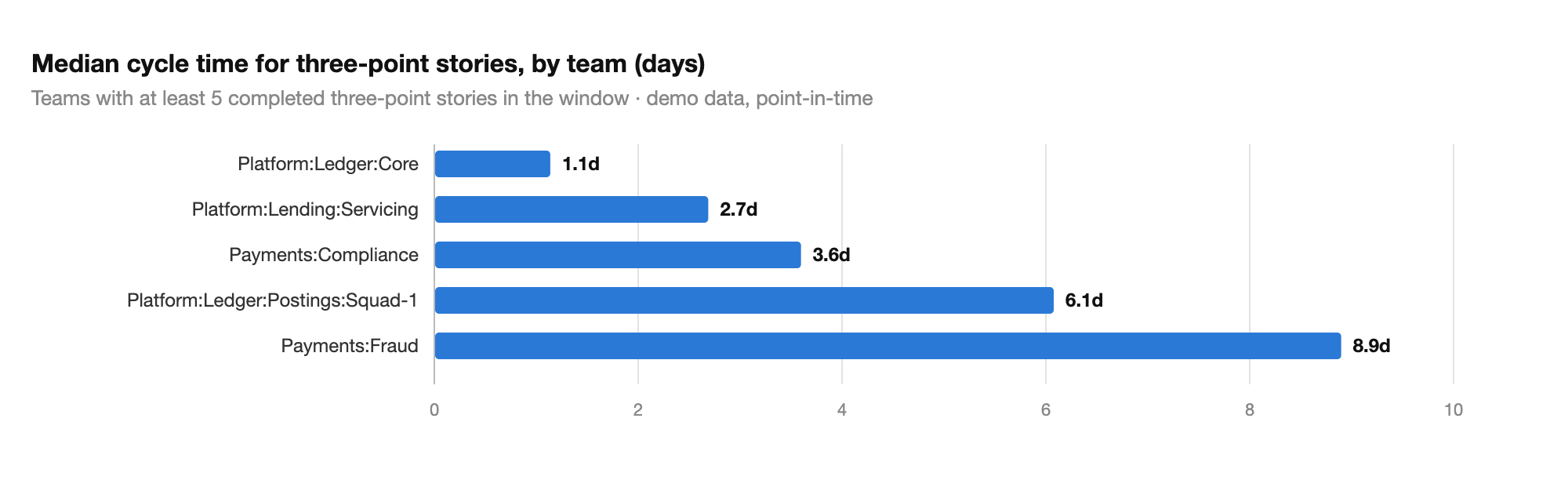
Cycle time broken down by story size is the table I show sceptics first. In the demo organisation, a median three-point story takes 1.1 days on one team and 8.9 days on another. Neither team is wrong; their scales are different instruments. But it means cross-team velocity comparisons, and any roadmap arithmetic built on them, are unusable until calibrated. The tool measures each team’s actual days per point bucket and forecasts from measured pace rather than nominal points.
The ranked queue, with the inversions flagged
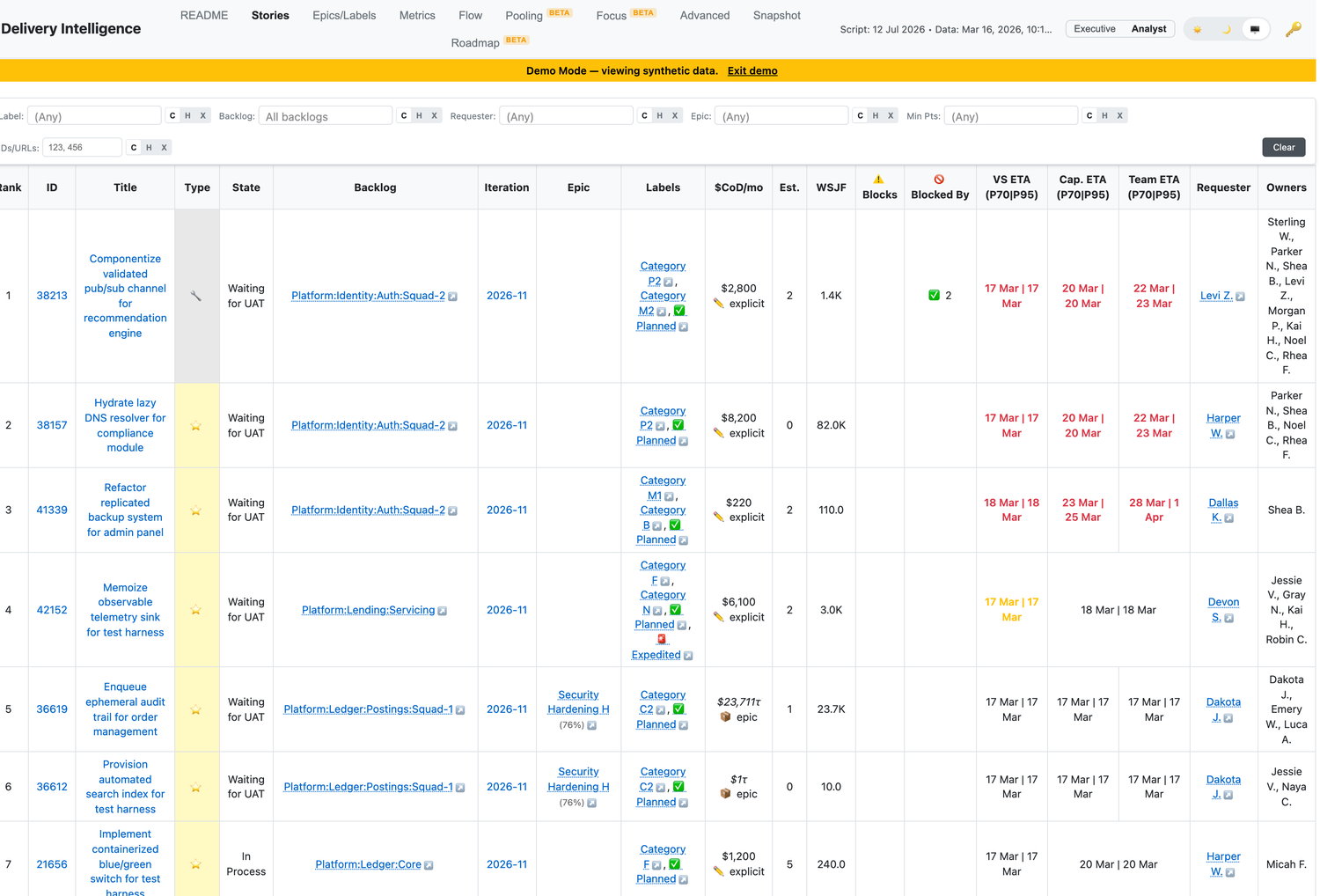
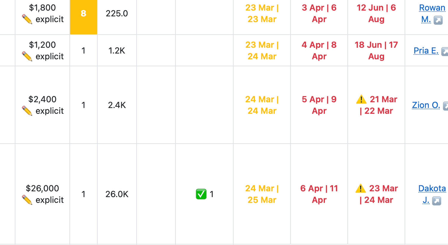
This view lists every open story in priority order, each carrying a completion range rather than a false-precision single date, at team, capability, and value-stream levels. Where a high-priority item is blocked by something ranked below it—a priority inversion that delays the very thing you said mattered most—it is flagged in place. Cost-of-delay overlays let you re-sequence by Weighted Shortest Job First, so the economics decide the order rather than the loudest voice in planning. I learned from DeMarco and Lister that single-point estimates are how projects lie to themselves; my advice to clients is to commit externally at the P95, plan internally at the P50, then track what share of work actually lands by the committed date.
What the waiting costs
Stories and epics can carry a value tag: cost of delay in dollars per month, assigned by the people who know the work’s worth. Every queue then has a price. In the demo dataset the tagged backlog carries $1.46M a month in modelled delay cost, and the largest single share ($946K a month) sits with one squad running 30% planned work. That’s a funding conversation, not a velocity conversation. Coverage is 39% of active stories, and the tool reports that gap rather than imputing values it was never given.
The cost of doing everything at once
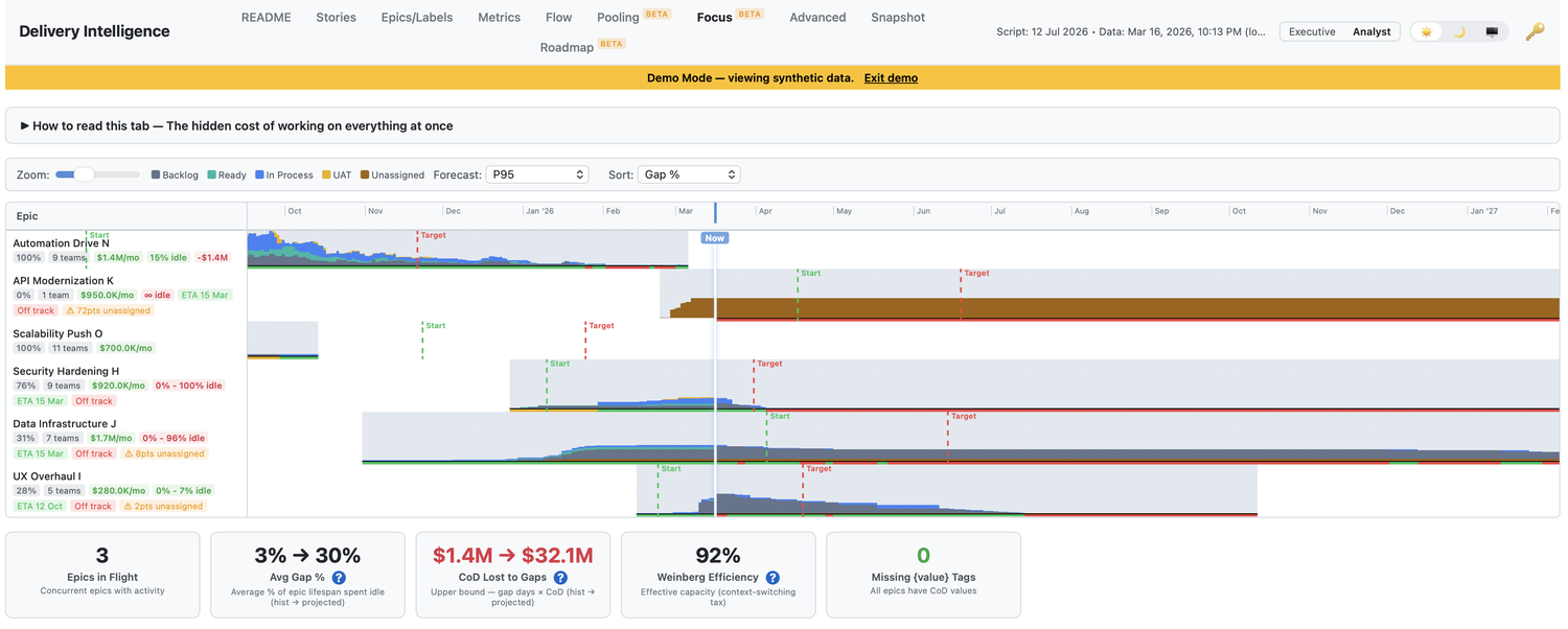
Spreading a team across concurrent efforts is rarely free, and the switching waste is only the first loss. Weinberg’s data puts it at 20% or more of capacity per additional concurrent project; run three at once and you could ship roughly twice as fast by doing one at a time. The bigger losses come after: start everything and nothing ships early, revenue and customer feedback arrive months later than they had to, and late feedback is how the wrong product gets built. I’ve charted Weinberg’s data and worked the full example separately. The tool prices what can be priced—switching waste and cost of delay—so a leader can see what “just start them all” costs.
Structure as a hypothesis you can test
Nothing in the tool reports on individuals; it stops at team level by design. I learned from Deming, and later from Sidney Dekker’s work on just culture, to read outcomes as properties of the system people work inside, and the data keeps agreeing: ageing WIP, backflow, and interruption load move with structure, staffing, and intake discipline long before they say anything about any person.
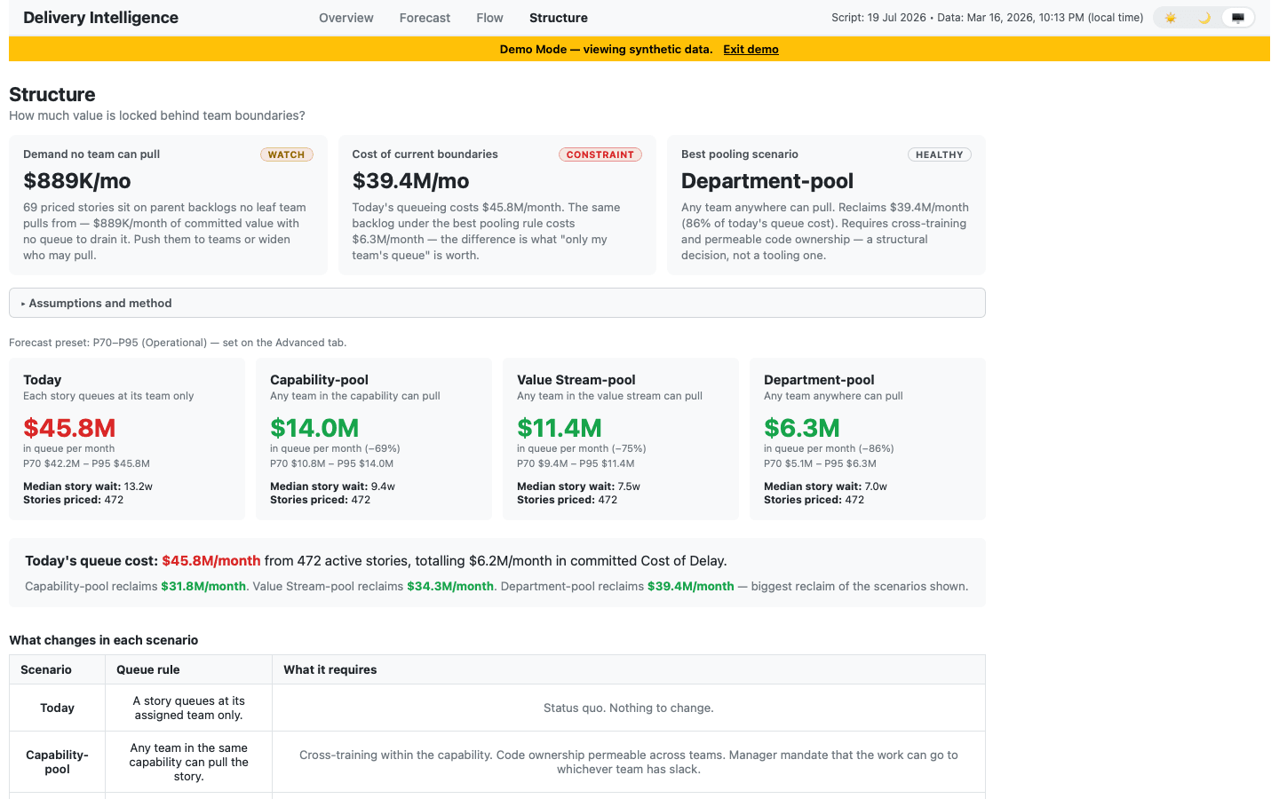
So the tool treats structure as the lever, and a reorganisation as a hypothesis to test before anyone inflicts it. The Pooling view simulates what happens to queues if adjacent teams pull from a shared backlog instead of separate ones.The classic single-queue result from queueing theory, applied to your actual backlog data. You can compare scenarios on paper, then decide whether the reorganisation earns its disruption.
2 The classic single-queue result from queueing theory, applied to your actual backlog data.
Records that tell the truth
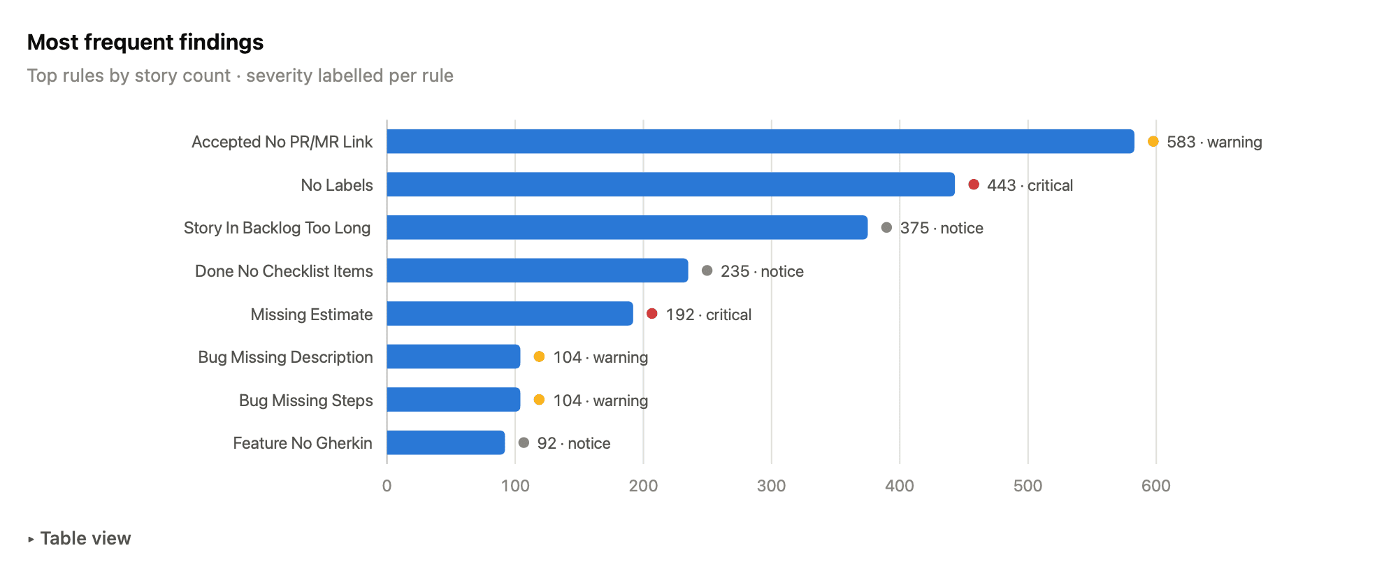
Forecasts inherit the quality of the records beneath them, so I built a separate tool beside Delivery Intelligence, a backlog data-quality robot: dozens of deterministic rules over every active story, each finding traceable to the story that triggered it. The rules catch missing estimates, bugs without priorities, work stuck in process, and accepted stories with no pull-request link. Many findings carry a one-click fix, and the fix leaves a comment on the story explaining what changed and why, signed by a friendly robot. Teams that want the nudge without the page get a digest in Slack.
An organisation you can poke
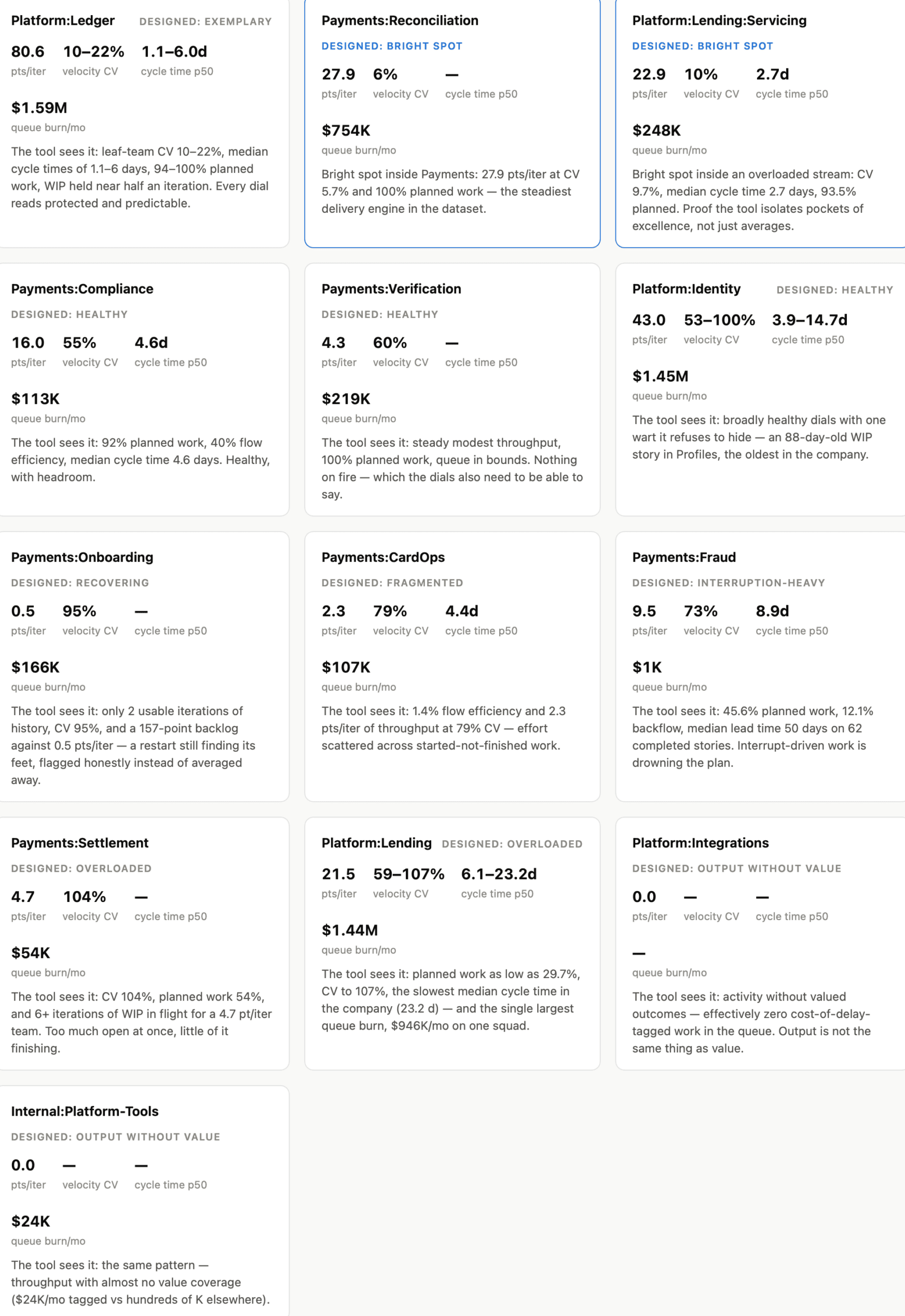
The demo dataset began as an anonymised capture of a real workspace, then went through a deterministic syntheticiser that moves every date, re-ladders estimates, and re-scales value tags within bounded transforms, with two build-failing gates: zero identifying terms survive, and every meaningful aggregate provably moved. Each value stream was then given a designed health profileOne exemplary and protected, one interruption-heavy, two overloaded, one fragmented, one recovering, two producing output without valued outcomes, plus two single-team bright spots inside rougher streams. and the tool was given none of these labels. Its metrics recover every one of them from the raw story data. That recovery is the strongest validation I can offer short of your own data.
3 One exemplary and protected, one interruption-heavy, two overloaded, one fragmented, one recovering, two producing output without valued outcomes, plus two single-team bright spots inside rougher streams.
How it is built
It’s a single-page application in vanilla JavaScript, no build system, no framework, which keeps it inspectable by anyone who can read a browser’s view-source. It connects to a team’s own work-tracking tool through its API, caches locally for speed, and can push a re-prioritised backlog back. One calculation engine serves three consumers: the browser app (with an analyst mode for practitioners and an executive mode that distils everything to four surfaces with plain-language reading notes), a CLI that emits schema-annotated JSON your own tooling or agents can consume, and the Slack quality digest. All the code that knows the tracker’s API lives behind a single adapter seam, enforced by a test that fails the build if tracker specifics leak into shared modules; Shortcut is the adapter that exists today.A Jira adapter was started and not finished. Golden-file tests pin every rendered number, so a change that shifts any metric shows up as a reviewable diff rather than a silent drift. It is always deterministic—every figure reproducible and auditable, with no model in the loop—and grounded in named theory throughout: Reinertsen and Little on flow and queues, Goldratt on the constraint, Kim and the Accelerate research on unplanned work, DeMarco and Lister on range forecasting over single-point guesses, Karen Martin on first-pass yield, Weinberg on the cost of context-switching. I design and build it myself.
4 A Jira adapter was started and not finished.
Delivery Intelligence needs a team’s delivery data in a tool like Shortcut, cleanly normalised—a real lift—so it belongs to embedded, hands-on work rather than a short fixed-scope diagnostic. But it is a straight look at how I read flow, and the kind of tooling I build so the change outlasts me.