

“Keep everyone busy” feels like a responsible management goal. In high-variation work like software development it makes the system much slower, and the math behind that is teachable.
Chapter 3 asked whether AI is a tool or an impetus for redesign. This chapter explores whether the system around it can actually move.
🎧 Prefer to listen? This chapter is narrated in my own voice, via ElevenLabs on Spotify, about 17 minutes. Listen on Spotify →
The two poles
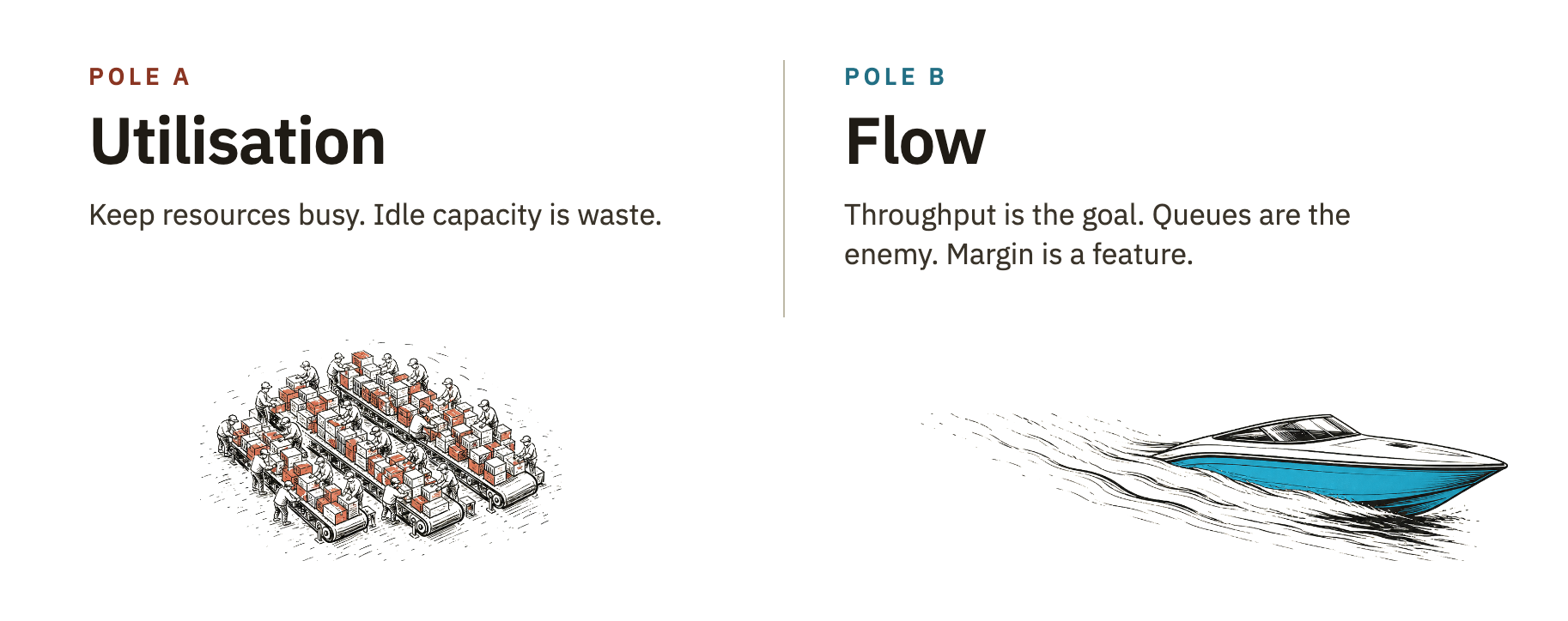
Pole A: utilisation. Keep resources busy. Any idle capacity is waste. Efficiency and output reports are the management metric. Manage costs first. Pole A leaders allocate every engineer to multiple projects and ask, are you fully booked? They fill an engineer’s calendar at 100% before the sprint starts.
Pole B: flow. Value throughput is the goal. Queues are the enemy: they limit our adaptiveness, sapping NPS and revenue because we can’t respond quickly to customer needs and changes in the market. Capacity margin is a feature.
Pole B leaders protect slack, accept idle time at non-constraints, and ask, “what are my queue lengths today?” as a leading indicator of lead times. These leaders don’t fill the calendar to the top. They protect 20–30% as slack, let the work pull through, and watch the queue lengths shorten.
A quick flow primer
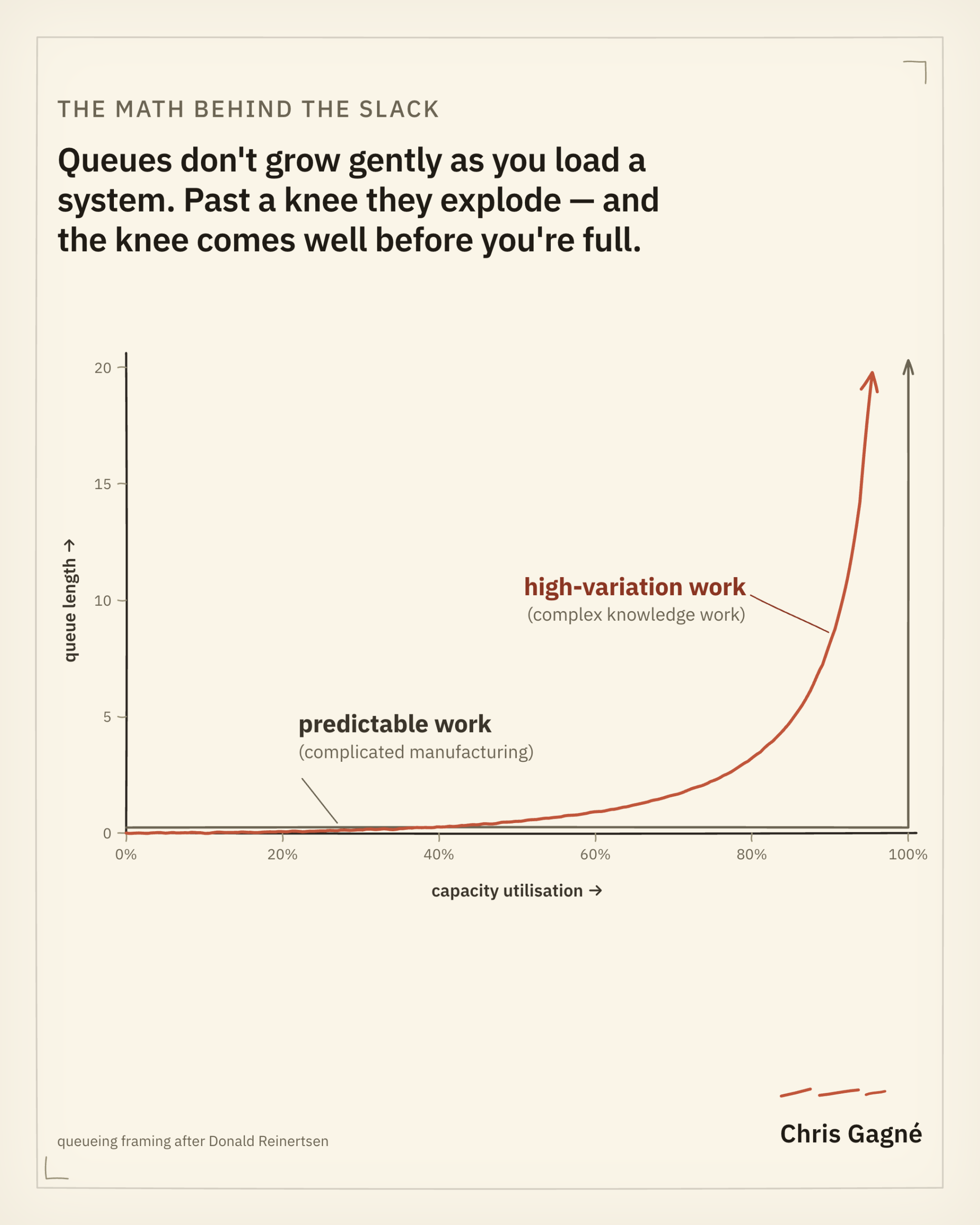
The math is unforgiving. Donald Reinertsen, in The Principles of Product Development Flow, draws it: queue size—and therefore wait times—against capacity utilisation.
For deterministic, predictable processes—a machine fed a steady, scheduled stream of identical jobs—utilisation below 100% capacity doesn’t invoke queues. A printer that runs 30 pages a minute, fed exactly 30 a minute, never backs up; queues form only when you ask for more than 30. (Let the jobs arrive in bursts instead, and the queue returns even below 30: it is variability, not load alone, that builds the line.) This is the mental model many managers use: “meat widgets” in Craig Larman’s particularly pointed phrasing.
Stochastic, highly-variable processes—like almost all research and software development—follow an entirely different curve: a hockey stick. The average queue is governed by a doubling rule: each time you halve the excess capacity, the queue roughly doubles. The jump from 60% to 80% doubles it. From 80% to 90% doubles it again. From 90% to 95%, again. Push utilisation toward the wall and queue time, not work time, comes to dominate cycle time, and small upsets in arrivals cascade into long delays. The optimum isn’t the peak; it sits well short of it, and how far short rises with your cost of delay.
The trick is to establish stable flow first, then increase utilisation. (For another visual representation of this, watch Henrik Kniberg, The Resource Utilization Trap, about 6 minutes.)
Where Pole A is right
Genuinely fixed-throughput operations with stable demand and homogeneous work. Call centres supporting highly-regulated queries with consistent call volumes and durations. Very mature manufacturing lines on a stable specification. The conditions are narrow, but they exist.
A leader running utilisation in those conditions is reading the system correctly. With effectively zero variability—or with value-add steps so decoupled that no step waits on another—high utilisation does compound into more output.
One reaction to learning about flow is to make Pole A look stupid. This is a mistake and we can celebrate the application of Pole A in the applicable contexts. The pin factory worked 250 years ago, the 1980s call centre worked (and still does), and the high-volume assembly line works today. The leader who came up running utilisation reports came up under conditions where the reports were the right report.
The reality test is the same as in chapter 3. Is the work actually pin-factory work? For most software-dependent organisations’ portfolios in 2026, no. Some of it is. Most of it isn’t.
Where Pole B is right
Pole B better fits systems with variable demand, heterogeneous work, or genuine complexity: most knowledge-work organisations, product-development pipelines, and engineering departments. The work moves the constraint around rapidly, so there is rarely a single fixed station to keep busy (chapter 8 shows why the constraint still governs even as it moves). What you manage instead is flow.
This is where Pole A’s intuition is most exposed. The leader sees utilisation and velocity as independent variables, when the relationship between them is the curve from the primer: mathematical, true by definition, and unforgiving. By Reinertsen’s running tally of his conference audiences, nearly everyone measures cycle time and almost no one measures queues. Queues are the one number the curve says governs the rest.
Idle isn’t waste: a pizzeria example
I often give the example of a pizzeria. The oven fits one pizza and takes 15 minutes to bake it. The chef needs no more than five minutes to remove, cut, and box the hot pizza and prepare the next one. So 10 of every 15 minutes, the chef has nothing to do at the oven. It would be clear to any manager not to expect the chef to stay constantly busy preparing pizzas for an oven that can’t bake them at the same rate; that is wasteful. Virtually any other activity, including remaining idle, would deliver more net value. Better still, point the spare capacity at the bottleneck (perhaps the chef learns a little engineering and doubles the oven’s capacity in their spare time), and you get the most value of all. Trust the chef with the slack.
Un-baked pizzas pile up as inventory, which is to say frozen cost, not value. What’s your backlog of half-specified roadmap items, if not the same pile?
Cost of Delay is the economic argument
The sharpest move I know for a Pole-B leader in a Pole-A org is to quantify the cost of delay. Reinertsen’s E3 principle is the canonical statement: if you only quantify one thing, quantify the cost of delay. Every queue carries a cost of delay, and the cost of delay is what makes utilisation expensive. Worse, when I went looking, no off-the-shelf tool could estimate and track the cost of delay in a software context, so I built one for my own client work. Even so, most organisations still lack the means.
Every queue carries a cost of delay, and the cost of delay is what makes utilisation expensive.
The reason the argument flips intuition is that Pole A’s intuition is correct about a different variable. The cost of an engineer’s idle hour sits on the P&L as a line item. The cost of an extra week in cycle time is invisible until you put a dollar amount on it. The dollar amount, when you actually run the calculation, is usually multiples of the apparent saving from “no idle time.” Reinertsen put numbers on that asymmetry as a McKinsey consultant in 1983: a product six months late to market lost 33% of its five-year profit, while shipping on time at 50% over budget cost about 4%.
The dollarisation is what wins the boardroom: the flow argument loses with most CFOs as queueing theory and wins as a cost-of-delay number in dollars per month. One of my clients had a monthly cost of delay that outran the entire annual build budget by an order of magnitude.
Would you rather cut costs by 10%, or raise them by 10% if it brings revenue forward and grows it by more? The value reaches the market sooner, and you have longer to exploit it. The upside need not even be direct revenue; it can be learning that arrives sooner and compounds into revenue later. The balance is lopsided, and the lopsidedness comes from where the money sits. BCG’s 2019 analysis of 35 software companies put median R&D spend among high-growth firms at 26% of revenue. Even a heroic 50% cut to that spend, which guts the capacity that builds the upside, claws back about 13% of revenue in cost, a hard ceiling, while the upside from shipping sooner carries no such cap.
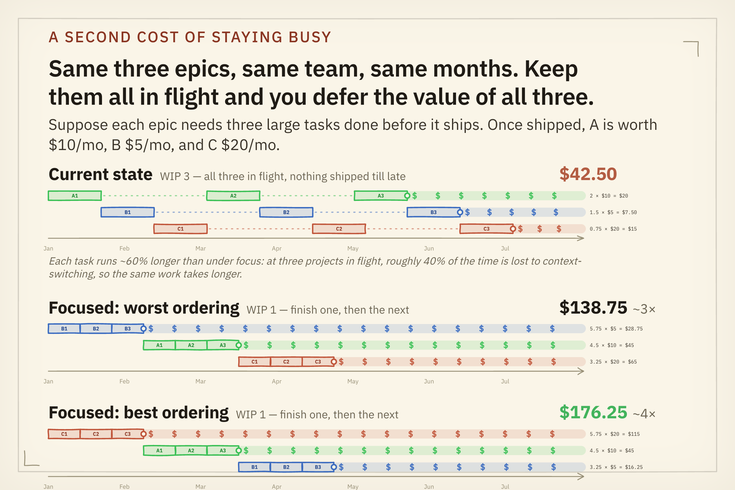
The opportunity cost compounds even further when work is completed in parallel, not serial. The utilisation reflex does more than keep individuals busy; it keeps many projects in flight at once, and that high work-in-process is its own tax. Take three equal-sized initiatives, one team, the same six months. Run them the Pole-A way, all three in flight, everyone busy, and you defer the value of all three: nothing ships until the end, so nothing earns until the end. Finish them one at a time instead and the same work, from the same team, delivers several times the value by the same date. The gain comes mostly from finishing one thing at a time; sequencing by cost of delay adds to it.
The AI overlay
Krivitsky, Larman, and Flemm call this the Ferrari Effect in 10X Org: picture each piece of work as a Ferrari built for speed, then jam them all on a one-lane road behind the same trucks. More Ferraris just means more traffic. AI hands every engineer a Ferrari; it doesn’t widen the road. The road is your structure, the handoffs and dependencies that decide whether work can reach a customer without waiting on someone else. Drop AI into a structure full of waiting and it amplifies the dysfunction already there. Their sequence is the whole point: first design, then AI.
Pole A leaders will buy faster AI tools and find lead times barely move: a little faster—maybe—but nowhere near enough to earn back the token spend, because the gain hits one node in a system already saturated everywhere else.
Further, the tool the leader consults will back the approach. Ask an AI agent how to capture the productivity gain and it answers in the paradigm it was trained on: load every engineer, raise utilisation, fill the queue. The advice is fluent and confident and aimed at the pole the leader already leans toward, because as we learned in chapter 1 the LLM’s training data reverts to the mode—not the upper deciles—of human knowledge.
The longest-lived, most fashionable queue in most software organisations is the one nobody calls a queue. It’s called the roadmap. What looks like a basic duty of product leadership is one of the most value-sapping artefacts an organisation can keep alive. Craig Larman, in his Certified LeSS Practitioner course, names a proxy for an organisation’s adaptiveness: the percentage of items in Sprint Planning and Product Backlog Refinement that didn’t exist before the last Sprint Review. An organisation adapting to its situation produces a high number against that metric; an organisation still working a years-old roadmap produces a low one. What most software companies call a roadmap—positive, forward-looking, a sign of seriousness—reads as a vestige of annual planning and a pathological queue length dressed up as a good thing. Ryo Lu’s no-fixed-roadmap line in chapter 3 wasn’t bravado. It was a Pole-B leader naming the queue out loud, and celebrating its clearing.
The diagnostic move
Three questions for last Tuesday’s allocation meeting.
Which pole was I claiming? If asked, would I have said I’m optimising for flow or for utilisation?
Which pole would the last sprint actually show? If a colleague counted how many engineers had no slack, would the number be small (Pole B) or close to all of them (Pole A)?
Which pole does this work actually require? Heterogeneous, ambiguous, learning-heavy work calls for Pole B. Routine high-volume work with stable specification calls for Pole A. Most knowledge-work portfolios contain some of both, and the proportion is the question.
Now that you have seen the relationship between utilisation and throughput, the question is what you do with it. Not what you would say in a strategy session, but what you reward when the quarter is measured. Most leaders never chose Pole A; they have simply never priced the queue, so the resource-management spreadsheet decides for them.
If you are reading this as the CTO or VPE thinking about your CEO: the move that matters on this axis is at the metrics layer your CEO controls. Put a single page in front of them showing the cost of delay on one current initiative, in pounds or dollars, dollarised against the quarter. Reinertsen’s point is that the variable that matters most is invisible in the default management report. Make it visible in the CEO’s unit of account. Your CEO won’t restructure around flow because you showed them Reinertsen’s hockey-stick curve. They will restructure around flow when the cost of not doing so shows up in the number they brief the board on. Chapter 3’s rule holds here too: a number gets you in the door, but the win is a named decision with an owner and a date, not the number itself. The sentence your CEO can carry to the board: “We have been paying for idle-time savings with delay costs many times larger.”
The exercise: sum the queues, then price them
If you summed the total queue lengths sitting across all your backlogs right now—the tickets parked between stages, the work that entered the system but never left it—what number do you get? If you can, adjust for planned and unplanned work as well as the coefficient of variation of your velocity. Most leaders have never added it up, because almost nothing totals it for them. An estimate may be the best you can achieve, which is why I built my own tooling to total it.
Second: convert it into a realised cost of delay. Take one initiative sitting in that queue, put a pounds-or-dollars figure on a week of delay against it, and multiply across the wait. Expect the figure to dwarf the idle-time saving the utilisation report is protecting. When I’ve run this with clients, it produces the same silence-then-ooooh a live demo does, because the variable nobody has dollarised is the variable nobody has been managing.
Going upstream
Watch. Henrik Kniberg, The Resource Utilization Trap (6 min): Reinertsen’s curves felt rather than read. Yuki Sugiyama et al., Shockwave traffic jams recreated for first time (3 min): a phantom traffic jam forming on a circular track without any bottleneck, Reinertsen’s utilisation and flow math in the wild. Recommended if you have the time: Don Reinertsen, The Logic of Flow: Some Indispensable Concepts, with slides (FlowCon San Francisco 2014, 33 min).
In-text: the references named in the body. Donald Reinertsen, The Principles of Product Development Flow (the canonical: the three curves, the cost-of-delay E3 principle, the 100-percent-measure-cycle-time / 2-percent-measure-queues tally). The adaptiveness proxy metric comes from Craig Larman’s Certified LeSS Practitioner course. Reinertsen’s 1983 McKinsey analysis, published as “Whodunit? The search for the new-product killers” in Electronic Business, is where the six-months-late / 50-percent-over-budget asymmetry comes from. The R&D-spend benchmark is Boston Consulting Group, How Software Companies Can Get More Bang for Their R&D Buck (November 2019), whose analysis of 35 companies puts median R&D spend among high-growth software firms at 26% of revenue. The Ferrari Effect is from Alexey Krivitsky, Craig Larman, and Roland Flemm, 10X Org: Powered by Org Topologies.
Go deeper: the Theory-of-Constraints lineage this chapter rests on, developed in full in chapter 8: Eliyahu Goldratt, The Goal (don’t maximise utilisation everywhere). The software translation: Jez Humble and David Farley, Continuous Delivery (the deployment pipeline as single-piece flow), and Gene Kim, Kevin Behr, and George Spafford, The Phoenix Project (Goldratt staged in IT operations, with Brent as the constraint made personal). The cost-of-delay and dollarisation lineage: Mary and Tom Poppendieck, Lean Software Development and The Tyranny of “The Plan”; Stephen Fox and Richard Gregory, The Dollarization Discipline. The instrumentation that makes the queue math visible to non-specialists: Daniel Vacanti, Actionable Agile Metrics for Predictability (cumulative flow diagrams, cycle-time scatter plots, service-level expectations as probabilities). The doctrinal tempo extension, developed further in the leader-leader instalment: USMC, MCDP-1 Warfighting (tempo is itself a weapon; the main effort / Schwerpunkt); Robert Coram, Boyd: The Fighter Pilot Who Changed the Art of War (the OODA fast-transient theory). The further software-engineering translation: Gene Kim, The DevOps Handbook, and Gene Kim and Steven Spear, Wiring the Winning Organization (the Three Ways of DevOps); Forsgren, Humble, and Kim, Accelerate (the four delivery metrics; Ron Westrum’s pathological / bureaucratic / generative culture typology, taken up again in the batch-and-flow instalment).
The utilisation trap is a gap between the efficiency we claim to want and the busyness we actually reward. Chapter 5 finds the same gap inside the leader. Chris Argyris called it the distance between espoused theory and theory-in-use, between what you say you believe and what you visibly did when the stakes rose. Every other axis in this series lets you sort yourself into the pole that flatters you. This one doesn’t, because your team watched you decide. They have better data.
I work with engineering leaders on exactly this kind of paradigm work, the deeper the better. If it’s live for you, I’m happy to talk: schedule a 30-minute virtual coffee at hi.chrisgagne.com.
Some book links here are Amazon affiliate links; if you buy through them I may earn a small commission, at no cost to you.
Leave A Comment